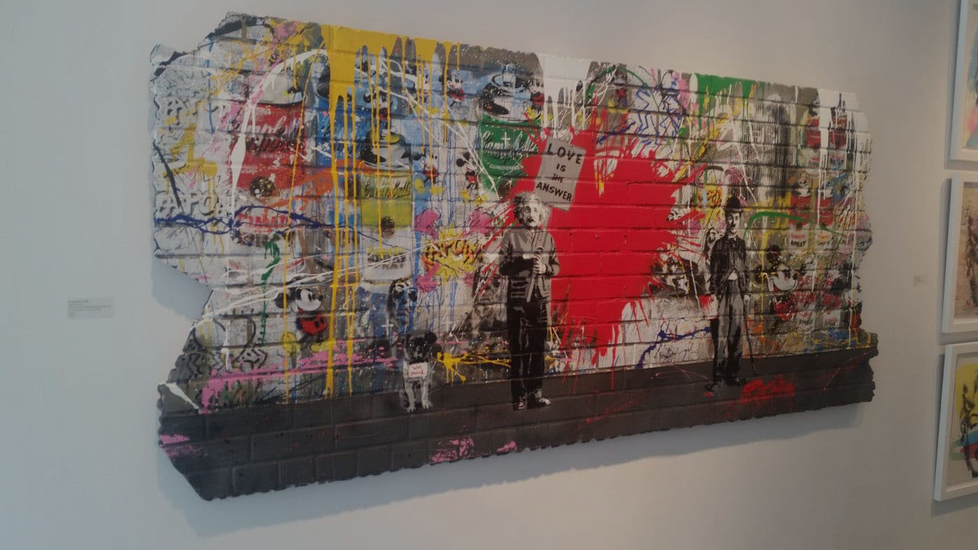
Since film is a visual medium, all aspects that come into play such as camera movements, lighting, design, background, acting, costume, special effects, and color are essential in telling a compelling story. In the early years of cinema, the limited technology at that time only allowed films to be shot in black and white.
While films in this era were absolutely stunning and extraordinary, they could’ve probably benefitted more from having color present as another layer to add depth as well as evoke certain emotions or feelings in the audience. Color, in particular, is an undervalued element that carries a lot of weight on the overall impact of the story. Let’s look at color theory and how cinema utilizes it to influence and enhance storytelling.
Colors Speak Louder than Words
If you look closely, films and TV shows nowadays heavily use color palettes that give them their distinctive look and feel. Award-winning directors such as Stanley Kubrick, Wes Anderson, and Quentin Tarantino are dubbed as masters of colors for the way they majestically use them to add personality and inimitability to their filmmaking style. When directors understand the concept of color theory, they’re able to evocatively speak to an audience in such a way that words nor actions cannot achieve.
In its simplest form, color theory is the art and science of utilizing colors to understand how they influence people’s perceptions, how color combinations mix, match, and clash with each other as well as the way they communicate a particular feeling or emotion. Just like in life, we are attracted to certain colors because it makes us feel a certain way and we have somehow created a universal understanding of how colors are used to communicate important information, especially when it comes to emergency symbols, street signs, or recognizing our favorite brands. Our brains use these pieces of information to process and make sense of the world around us.
Stanley Kubrick, Wes Anderson, and Quentin Tarantino are dubbed as masters of colors
“People decide whether or not they like a product in 90 seconds or less. 90% of that decision is based solely on color. So, a very important part of your branding must focus on color,” via 99designs.
In cinema, directors use color to mimic a period in the past, differentiate the present from a backstory or dream sequence, intensify the characters’ disposition, time of day, and weather as well as set a distinct tone and mood for the entire film.
“A director’s use of color combinations can evoke a mood or atmosphere within the world of a film. Cool, unsaturated colors may be used to create an atmosphere of gloom, rich greens and earth tones can create feelings of balance and symbiosis, and vibrant colors on the warmer end of the spectrum can bring energy and intensity to a film—or, in the case of the potent reds of Martin Scorsese films like Taxi Driver, a sense of impending violence.”
Choosing the right colors can elevate and enhance the atmosphere as well as the emotion of the characters, locations, dialogue, and subtext. When something is both visually appealing and informative, audiences would more likely be able to relate to and absorb what’s being presented to them.
Choosing the right colors can elevate and enhance the atmosphere as well as the emotion
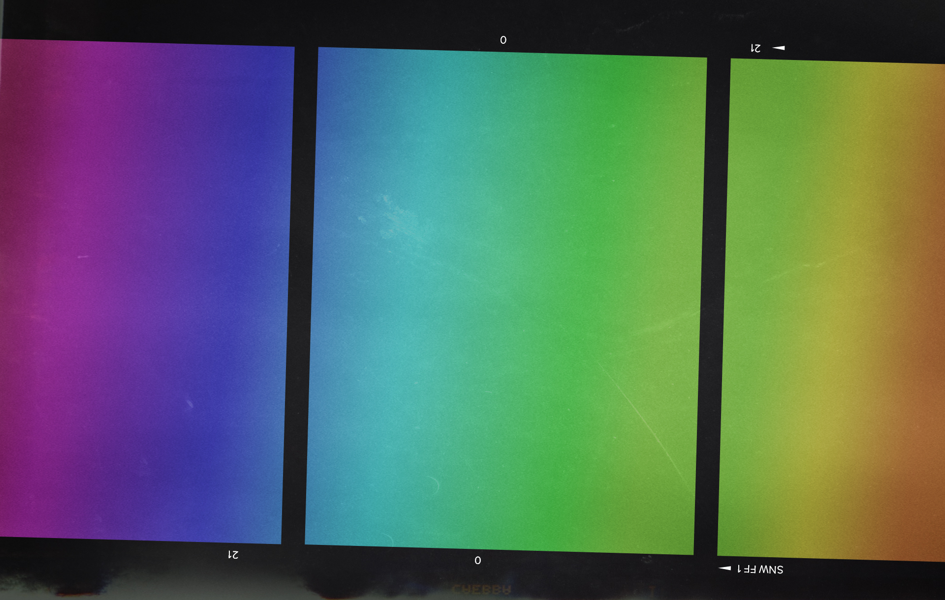
How do you choose the right colors? The answer’s easy – we go back to the color wheel basics that were taught to us in kindergarten art classes. As we know, the color wheel contains different color systems such as primary colors (blue, yellow, and red), secondary colors (they are the combination of primary colors such as orange, green, and purple), and tertiary colors (the mixture of primary and secondary colors that create pairs such as blue-green, red-violet, yellow-orange, and yellow-green).
When you separate the left and right sides of the wheel, you’ll see that one side has warm colors (red, orange, yellow) and the other side consists of cool colors (blue, green, purple), and knowing which temperatures and color combinations that complement each other is vital in understanding the kind of message, impression, or feeling you want to impart to your audience.
To make a color palette for your film, here are some of the techniques that color graders use to help create a unified and compelling mood and style:
Using Complementary Colors
These are color pairs that consist of primary and secondary colors that are opposite to each other on the color wheel. For instance, color pairs such as red and green or yellow and purple are good examples of complementary colors. Due to the high contrast between these colors, they can make visual elements stand out and come off as bold.
Using Analogous Colors
These are located next to each other on the color wheel such as red, orange, and yellow. These colors bring harmony to each other, with one color as dominant, one as supporting, and another that would serve as an accent. They emit a satisfying feeling of serenity, calmness, and cohesiveness.
Using Triadic Colors
These are three evenly spaced-out colors on the wheel such as red, yellow, and blue, that both create high contrast and harmony because of their vibrant and energetic color combinations. In a triadic scheme, one color will be dominant and the other two will be used as accents. These colors convey lively and playful emotions that are usually seen in superhero and whimsical films.
The world we see is full of colors that give it life and meaning. Colors may often be put on the sidelines, but little did we know that their purpose goes beyond aesthetic reasons as proven by the color theory. Knowing the psychology of how colors affect perception and emotions allows filmmakers to effectively breathe life into the story, world, and characters using visual elements. Incorporating these basic schemes will make it more impactful and provide a memorable viewing experience for audiences who invest their hard-earned money into your craft.